Creating a home that looks like it stepped off the pages of an architectural digest or a curated Pinterest board is less about the size of your budget and more about the precision of your choices. The “Pinterest Aesthetic” is defined by a harmonious blend of textures, a focus on intentionality, and the courage to mix high-end silhouettes with organic, earthy elements. Whether you are aiming for “Warm Minimalism” or “Modern Organic,” these ten design trends are currently dominating the digital landscape and offer a blueprint for a sophisticated, magazine-ready interior.
1. Earthy Neutrals
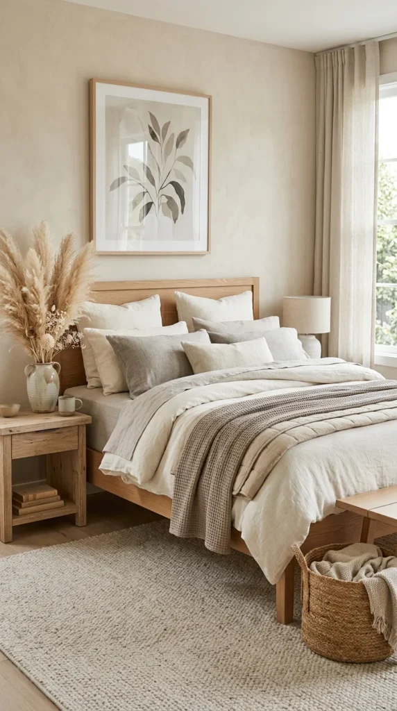
The shift away from clinical, cold grays toward “warm neutrals” has revolutionized modern home decor. This palette relies on off-whites, sands, ochres, and mushrooms to create a space that feels both expansive and cozy. To achieve this magazine look, avoid using a single shade of white. Instead, layer tonal variations of the same color family.
- Tone-on-Tone: Use different shades of the same color to create depth without visual clutter.
- Tactile Variation: Mix matte painted walls with boucle fabrics, linen cushions, and silk rugs.
- Natural Transitions: Use wood grain and stone patterns to break up solid blocks of neutral color.
2. Biophilic Design
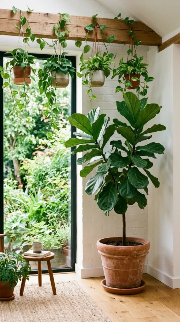
Biophilic design is more than just buying a few houseplants; it is about integrating nature into the very fabric of your home. High-end interiors often feature “hero plants”—large, architectural greenery like a Bird of Paradise or an Olive Tree—that act as living sculptures.
- Verticality: Use tall plants to draw the eye upward, making ceilings feel higher.
- Natural Materials: Complement greenery with jute, rattan, and unpolished stone.
- Light Maximization: Use sheer curtains to allow natural sunlight to filter through, mimicking the dappled light of a forest.
3. Statement Lighting
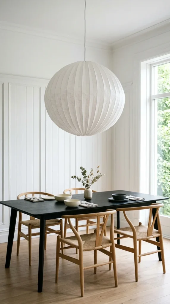
In magazine-worthy homes, lighting is never an afterthought; it is the focal point. Pinterest is currently obsessed with “oversized” lighting—fixtures that feel slightly too big for the space, creating a dramatic, curated effect.
- The Rule of Scale: Go larger than you think you need. A massive pendant over a dining table creates an instant “wow” factor.
- Materiality: Look for pleated fabric, hand-blown glass, or blackened steel.
- Ambient Layers: Always include three levels of light: overhead (statement), task (reading lamps), and accent (LED strips or candles).
4. Curved Furniture
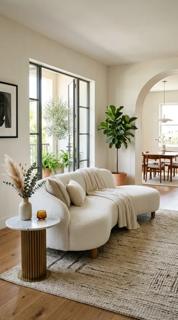
Sharp corners are being replaced by soft, organic curves. This trend, often referred to as “Curvy Modernism,” draws inspiration from 1970s Italian design. It softens the “boxiness” of standard rooms and creates a flow that feels more expensive and custom-made.
- The Arched Mirror: An easy way to introduce curves is through a large floor-length arched mirror.
- Circular Seating: Swivel chairs with rounded backs or “bean” shaped sofas promote conversation and comfort.
- Architectural Interest: If possible, introduce curves through DIY archways or rounded kitchen islands.
5. Fluted Textures
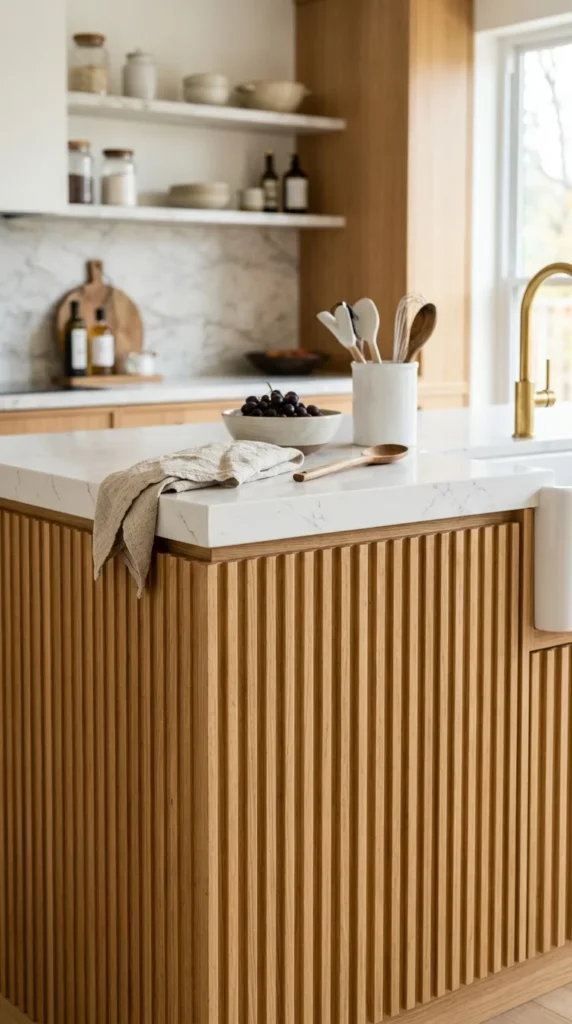
Fluting—a series of shallow grooves running vertically—is a hallmark of high-end cabinetry and furniture right now. It adds a rhythmic, architectural quality to surfaces that would otherwise be flat and uninteresting.
- Furniture Details: Look for fluted sideboards or coffee tables to add a “designer” touch to your living room.
- DIY Fluting: Many homeowners are using half-round wooden dowels to create fluted feature walls or to “upcycle” plain IKEA furniture.
- Subtle Contrast: Pair the vertical lines of fluting with smooth surfaces like marble or glass for a sophisticated balance.
6. Layered Textiles
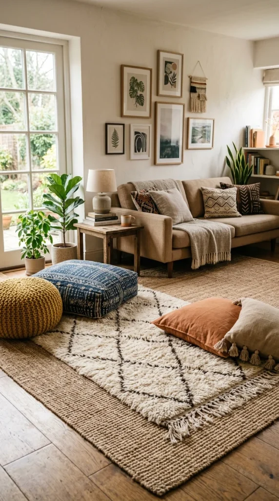
The secret to that “lush” feeling found in magazines is layering. A single rug often looks lonely in a large room. By layering a patterned or high-pile rug over a larger, flat-weave natural rug (like sisal or jute), you create a sense of abundance and luxury.
- The Foundation: Start with a large, neutral rug that covers most of the floor.
- The Accent: Place a smaller, more expensive or textured rug on top, usually under the coffee table.
- Pillows and Throws: Never use just two pillows on a sofa. Mix sizes, shapes, and fabrics (e.g., velvet, linen, and chunky knits) to create a professional look.
7. Limewash Walls
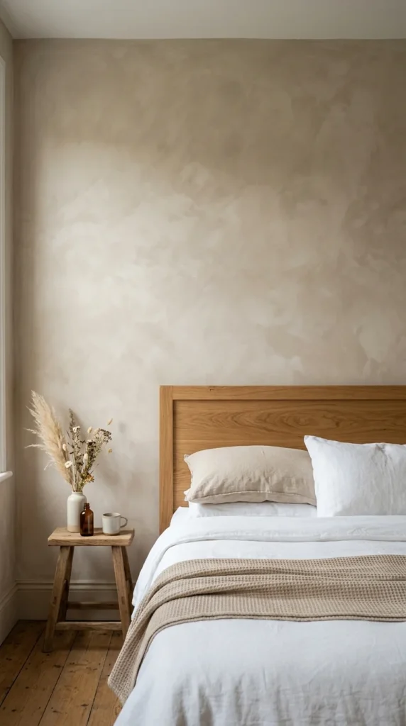
Flat, plastic-looking paint is out. Textured, breathable finishes like limewash or Roman clay are in. These finishes create a soft, mottled effect that adds “soul” and history to even the newest of builds.
- Depth and Movement: Limewash reacts to light throughout the day, making the walls look like they are glowing.
- Matte Elegance: The chalky, matte finish hides imperfections and provides a perfect backdrop for minimalist decor.
- Organic Feel: It brings an artisanal, “handmade” quality to the room that standard emulsion paint cannot replicate.
8. Gallery Walls
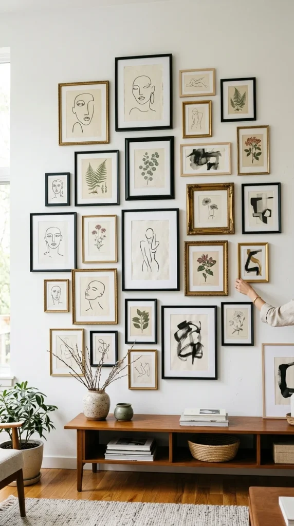
While “minimalism” is popular, the “collected” look is equally prized on Pinterest. A well-executed gallery wall tells a story and makes a home feel lived-in rather than staged. The key to the magazine look is a “curated” rather than “cluttered” arrangement.
- Asymmetrical Balance: Don’t worry about perfect symmetry. Focus on balancing the “visual weight” of different frames.
- Cohesive Palette: Keep the art within a specific color story (e.g., all black and white, or all warm earth tones) to keep it looking sophisticated.
- Mixed Media: Incorporate more than just prints. Add a small wall sculpture, a vintage clock, or a framed piece of textile.
9. Floating Shelves
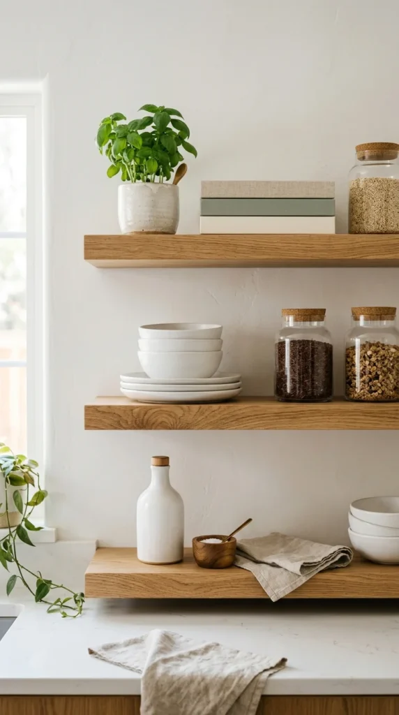
Open shelving has moved beyond the kitchen and into the living and dining areas. The “shelfie” is a Pinterest staple, focusing on the art of “styling” rather than just “storing.”
- The Rule of Three: Group items in threes, varying their heights and textures.
- Negative Space: Don’t crowd the shelves. Leave “breathable” space between objects to make each piece feel important.
- Functional Art: Use beautiful everyday objects—like handmade ceramics or brass kitchen scales—to decorate the shelves.
10. Mixed Metals
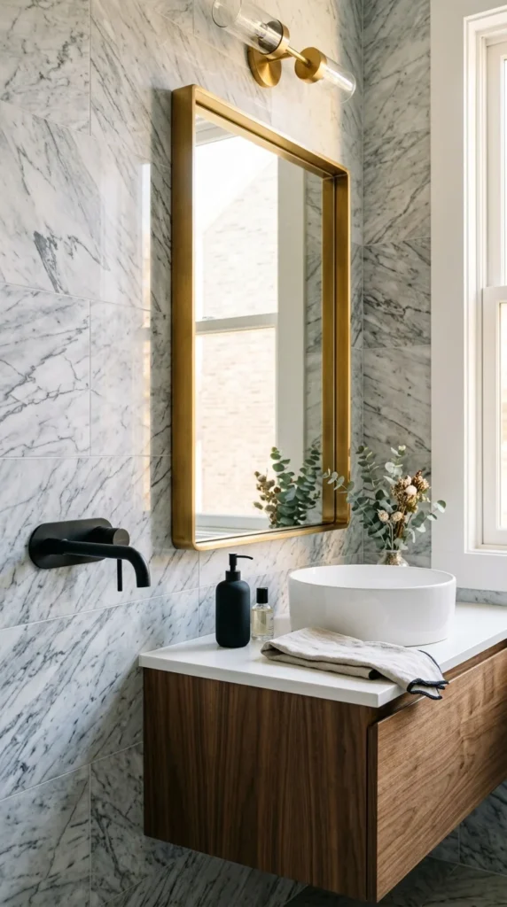
The old rule that all your hardware must match is gone. Magazine-style homes thrive on the “collected over time” look, which involves mixing different metal finishes like brass, black steel, and polished chrome.
- The 70/30 Rule: Choose one dominant metal (e.g., brushed brass) for 70% of the fixtures and an accent metal (e.g., matte black) for the remaining 30%.
- Vary the Sheen: Mix brushed finishes with polished ones to add visual interest.
- Consistency: Keep the “vibe” consistent. For example, if you choose modern silhouettes, ensure both metals are used in modern-shaped fixtures.